”The Crystal Goblet”
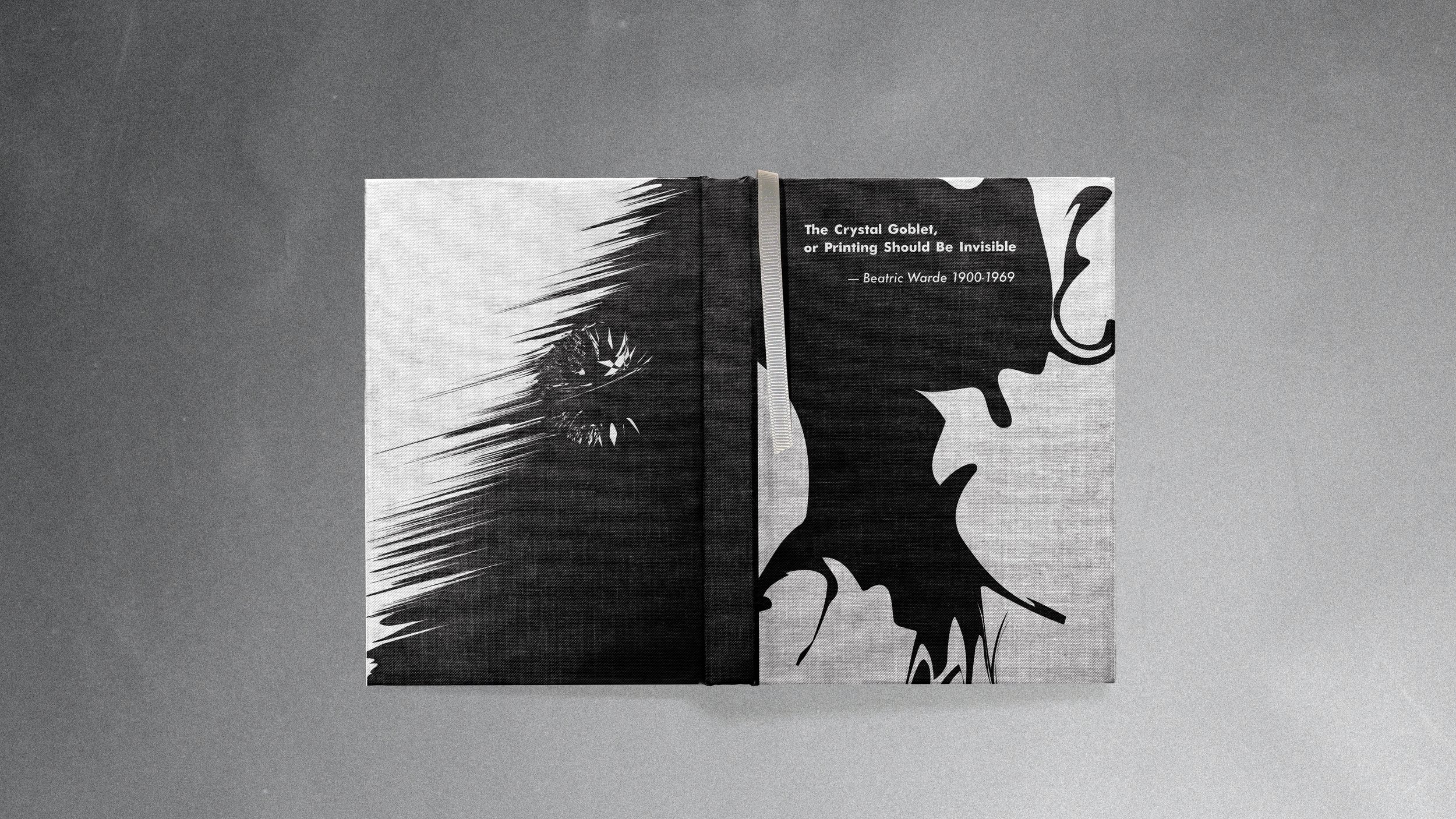
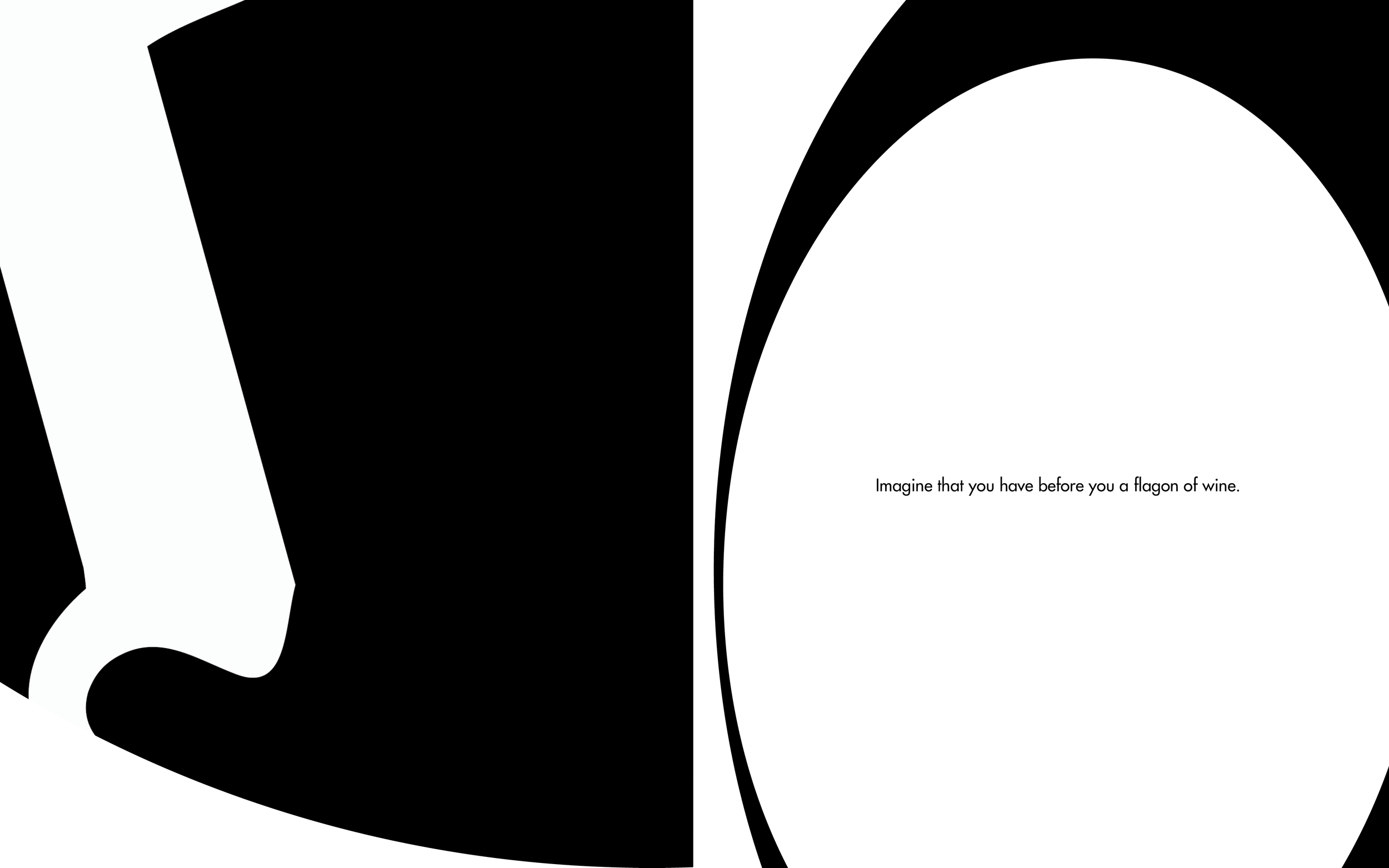
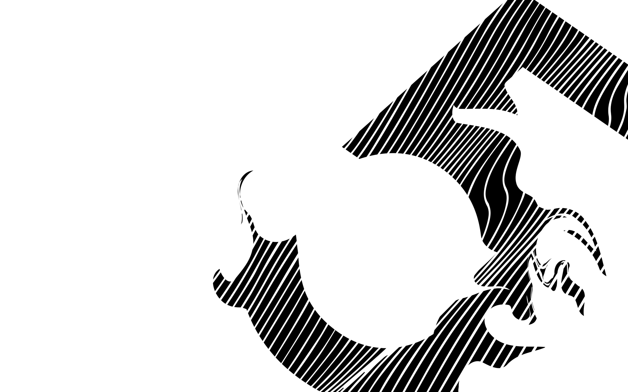
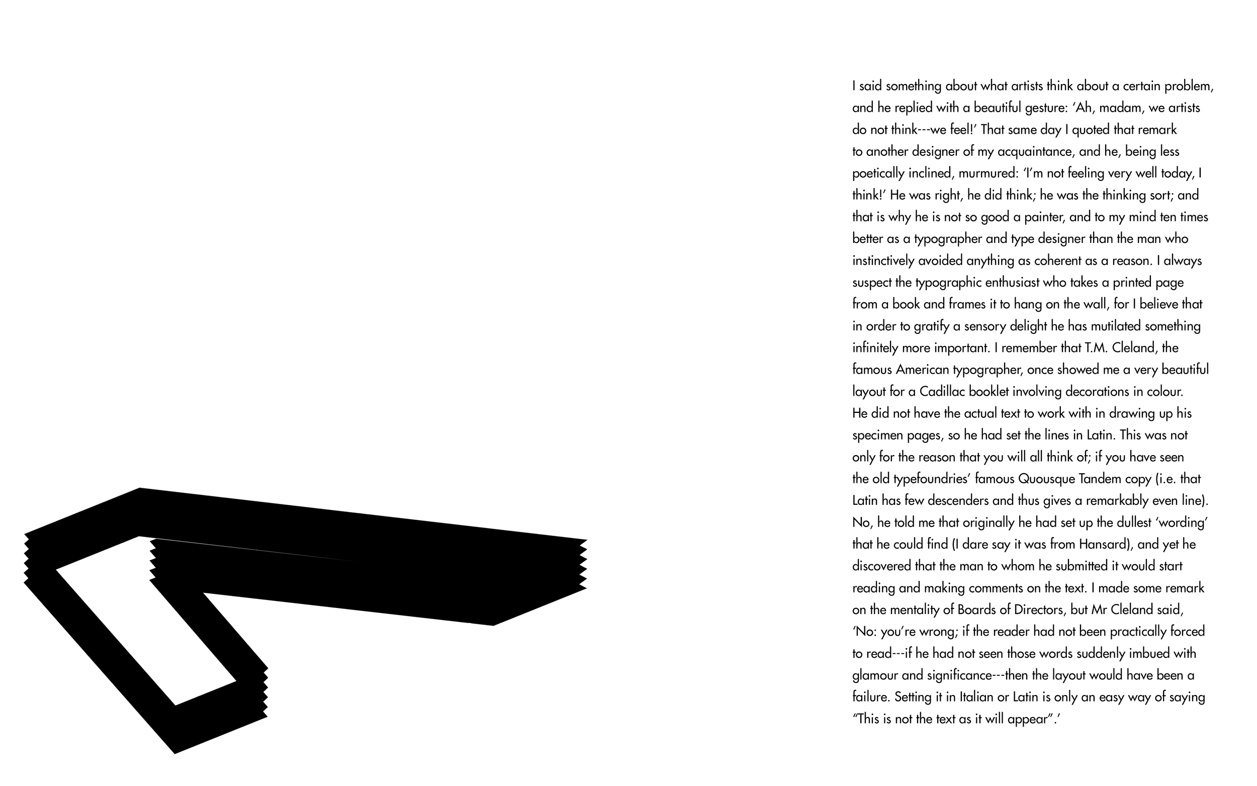
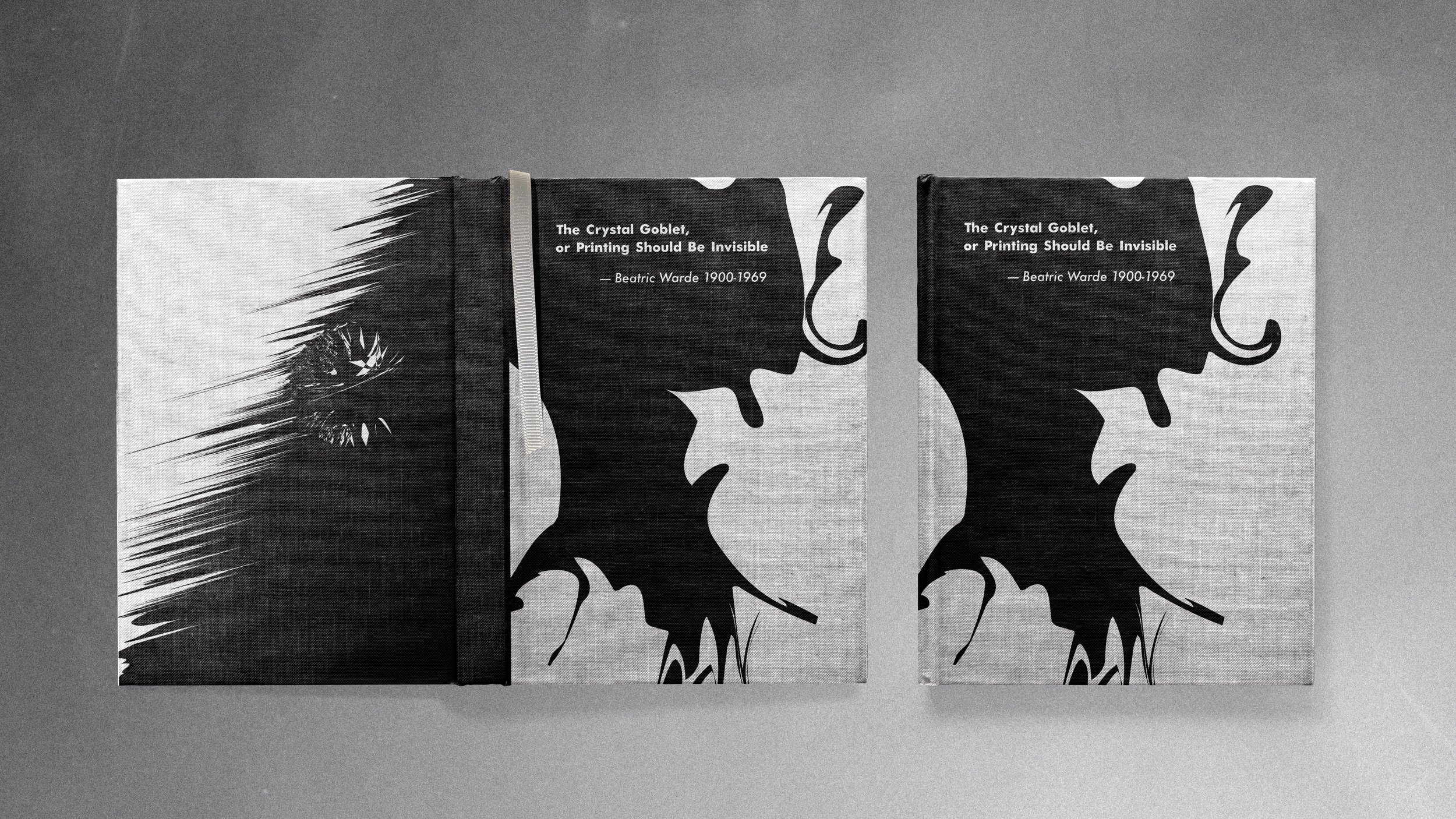
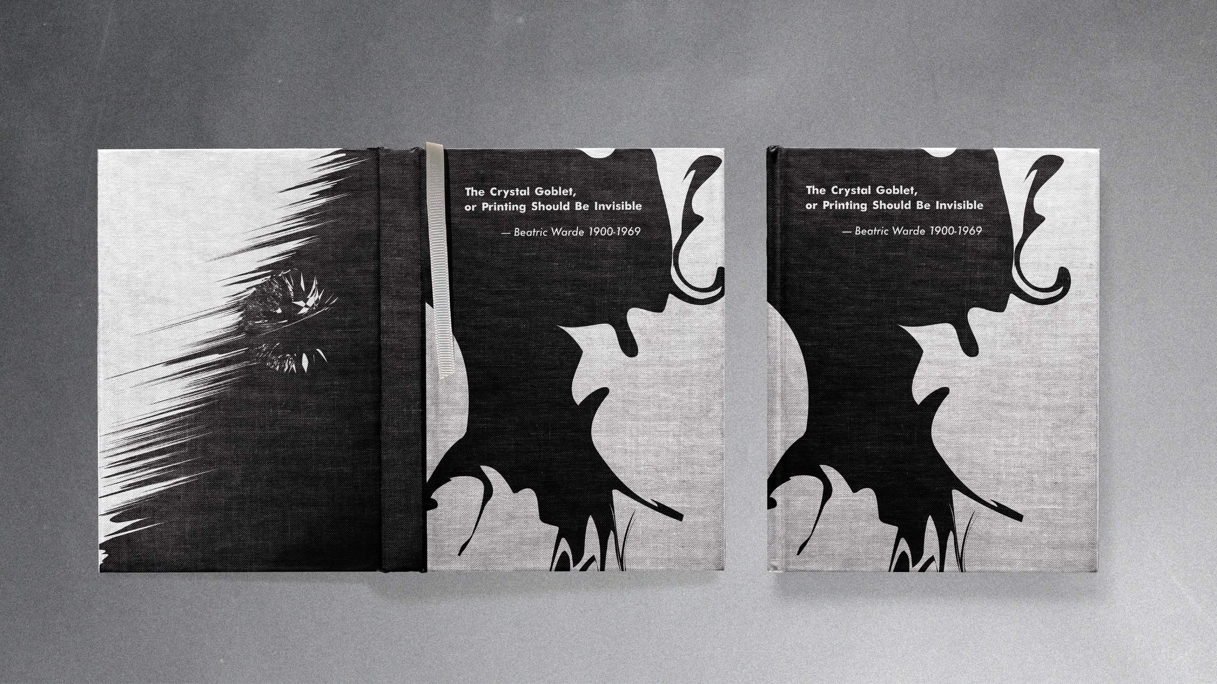
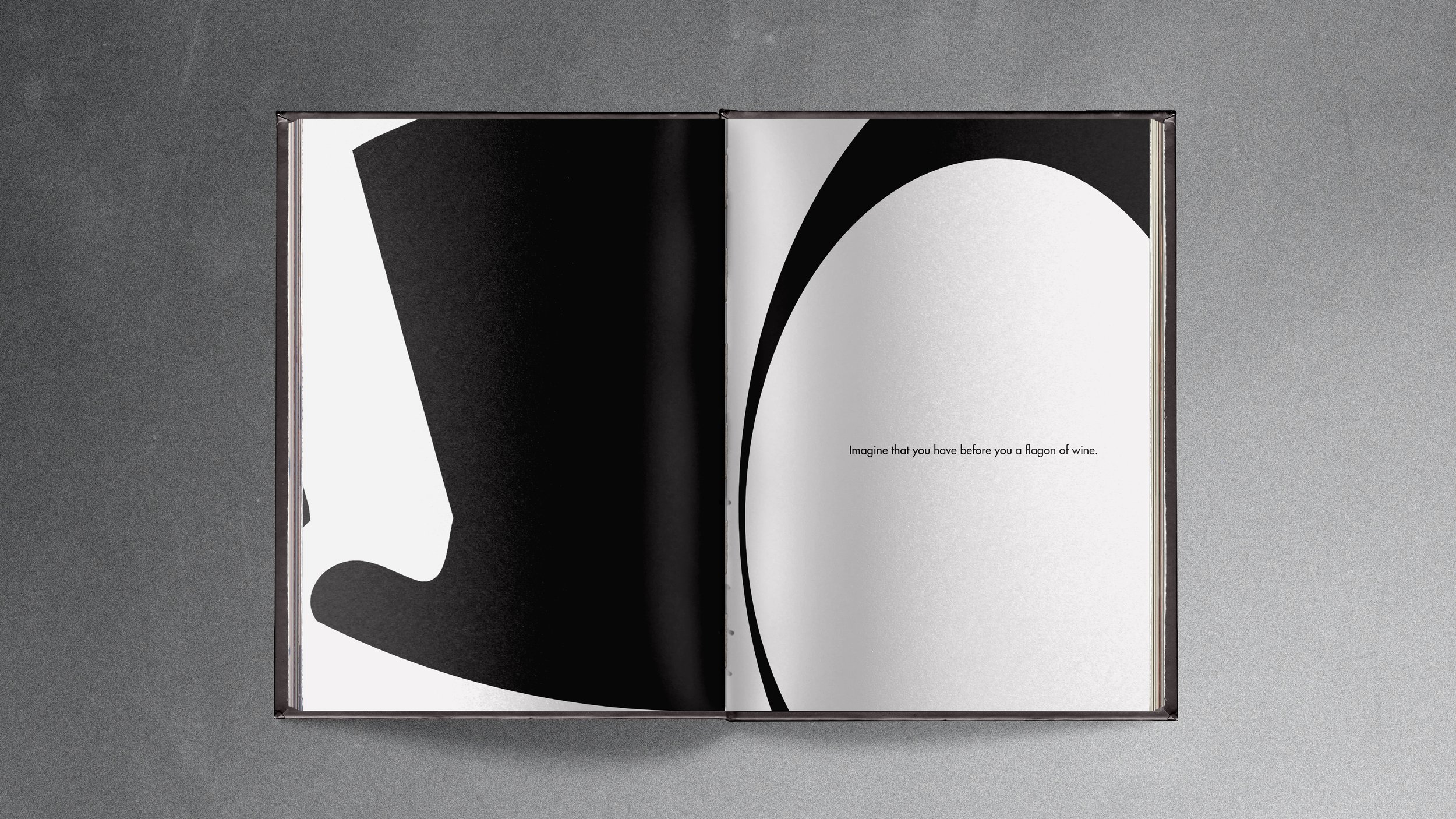
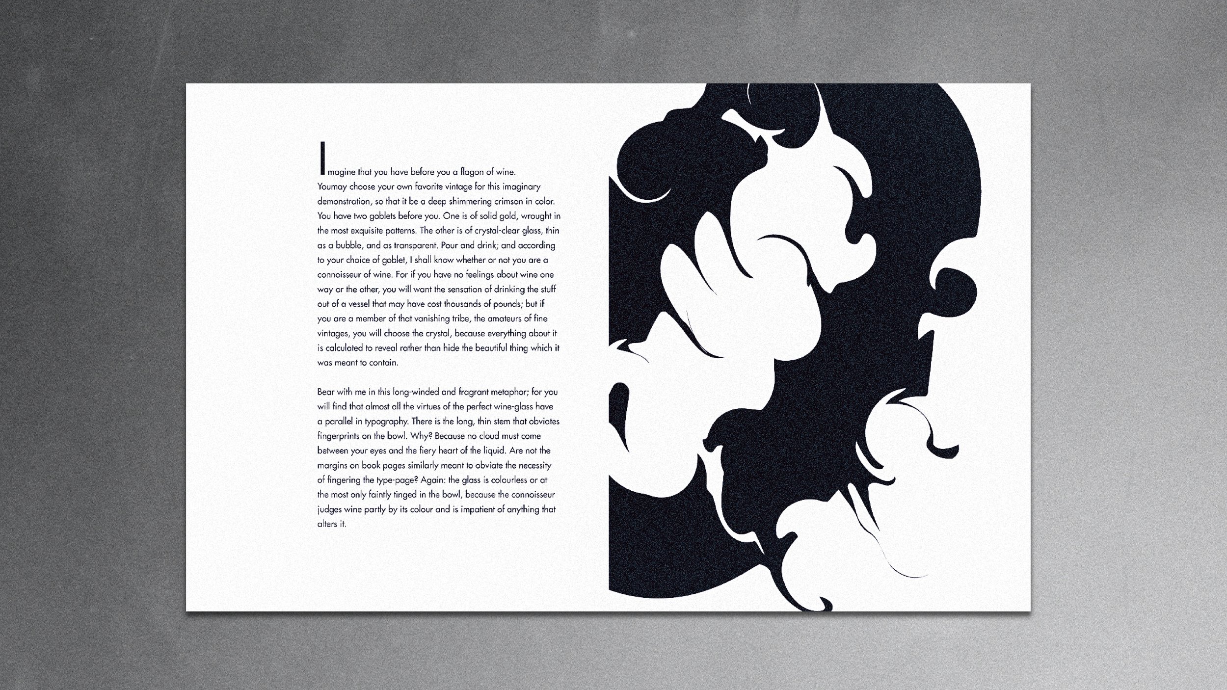
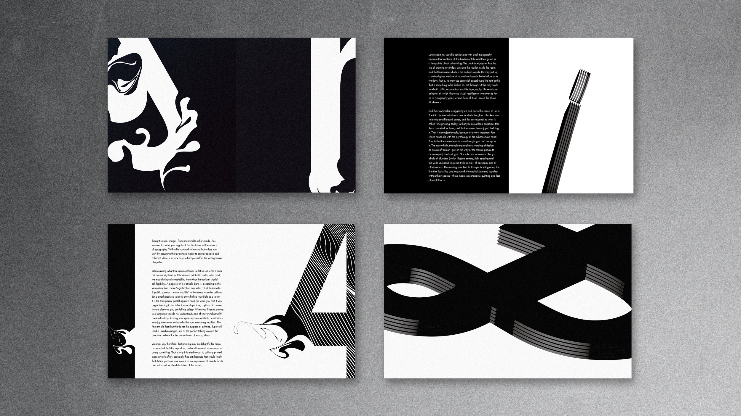
This is an editorial design of Beatrice Warde’s publication of “The Crystal Goblet”, which defines good typography as a crystal goblet, her address argues that the true art of designers is the creation of transparent interfaces which allow readers to imbibe deeply of the intellect captured within the pages of the book without external distractions.
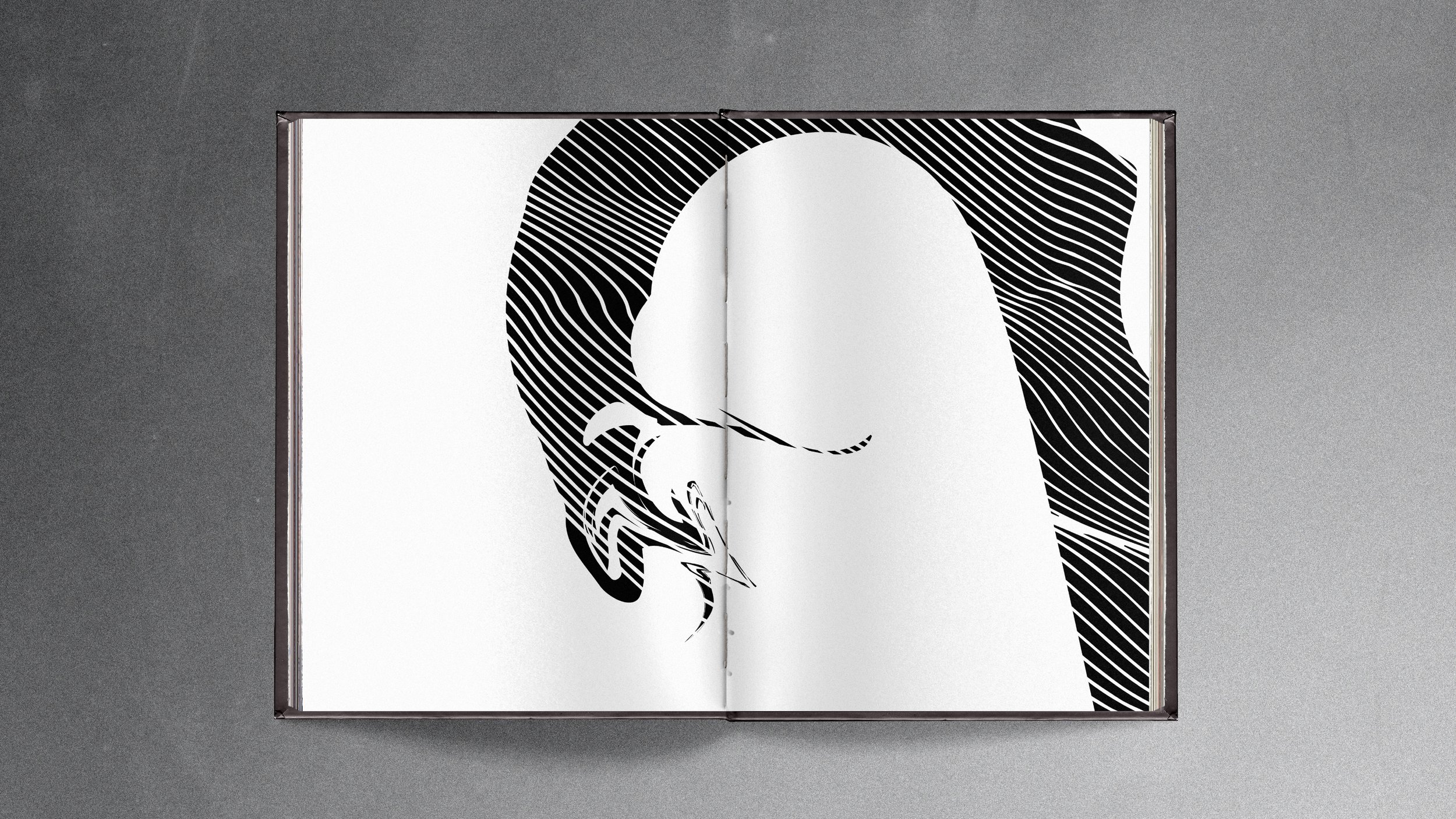
In the design, I use the Futura typeface in the book and feature different type transformations and show various visual compositions.
/2020
/Instructor: Philip Dibello
/Editorial Design
